This past February and March 2017, I was honored to teach another class of wonderful, dedicated Evening Basic Drawing Students at the St. Louis Artists’ Guild. We had a big class, 8 people, and I was very pleased with everyone’s progress.

First class 2.9.17 – Gesture Drawing

Another angle – first class, Gesture Drawing

Fourth class, Intuitive Perspective
Mary Forrester was our gesture model for the first class, who inspired us with many elegant poses. During the first meeting, I introduce gesture drawing as a way for students to start loosening up their drawing motions and to connect what they’re seeing in their visual field with what their hand is doing on the page, with the goal of eventually looking at the subject more, and the drawing on the page less.
For the fourth class, we did Intuitive Perspective, during which students learned how to gauge accurate perspective by noticing the angles of the edges of surfaces and how they relate to one another, as well as the angles of the empty spaces between or around the objects, so that they could create a convincing depiction of depth. For a couple of the still lifes, I had the students either move closer to the objects, or to the side, so that they could understand just how much the perceived angles of rectilinear objects change when viewed from different vantage points.

Extended line drawing exercises, and exploration of negative & positive space

Extended line drawing exercises, and exploration of negative & positive space from another angle

Perceptual Grid and Mondrian Tool exercises

Perceptual Grid and Mondrian Tool exercises

Perceptual Grid and Mondrian Tool exercises
For the sixth class, we started by doing extended line drawings of simple objects that had a lot of empty spaces between legs or rungs of objects so that the students could learn how to further enhance their drawing’s proportion by sketching how the different angles of each part of the object align with other parts, helping them notice the shape of the spaces in between the physical elements. To further enhance that idea of negative and positive space, I had the students shade the area around and between the various parts of the object dark, so that they began to think of those spaces as the object of their drawing, and then I had them erase out the object itself, as if it had been cut out of the picture plane. Many students expressed surprise at just how much this activated the various shapes for them, and really helped them to understand that if all the angles and spaces between the various parts looked proportional, then the object itself would by default then appear more proportional.
During the next class, we further explored that idea by using the Perceptual Grid/Mondrian exercise by starting with a gesture drawing, as they normally would, and then using rulers to add a fine grid of lines horizontally and vertically across the picture plane, to help analyze the spacing between objects, making corrections along the way.

We first began with the newsprint that we had been using, toning the paper with charcoal to create a mid-range tone for the background

My demo for chiaroscuro drawing using toned paper, drawn while the students observed.

For the second half of the class, I had the students draw on Kraft paper, using the brown of the paper itself as the mid-tone.
We studied Chiaroscuro drawing for the last two classes, giving the students time to really delve into understanding how continuous tone and dramatic lighting can be used to create a wide range of lights and darks and convey a greater sense of depth, even atmosphere and emotion. Chiaroscuro is a classic technique used since the Renaissance using high-tone, mid-tone and low-tone mark-making to depict shape and volume in drawings and paintings. The first part, chiro means ‘light’ and the second, scuro means ‘dark’, in Italian.
For the first half of the final class, I had the students tone the paper with charcoal, so that they could use that as a mid-tone background to help better gauge the range from light to dark. The lights were created by erasing out areas (and some students later added white conté), and the darkest darks were created by adding more charcoal, black conté, or compressed charcoal to the surface for rich, deep blacks. I seem to have missed taking in-progress photos of the charcoal mid-tone drawings from this portion of the class, unfortunately, but you can see some of my prior students’ Chiaroscuro drawings here: Summer 2016 and here: Fall 2016.
For the second half of the final class, I added the additional challenge of using toned paper (paper that has a noticeable color other than white) as the drawing surface, so that the brown of the kraft paper acted as the mid-tone, rather than a layer of medium charcoal. Not only was the surface texture toothier than the smoothness of the newsprint, causing the mark-making to act differently, but converting the idea of a color other than grey as a mid-tone when we’ve only been working mono-chromatically added another element of difficulty. My students were up for the challenge!
Here are some finished pieces from the Spring class:

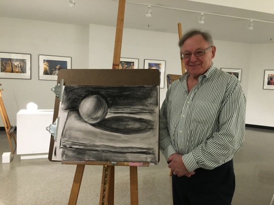
Carol Fichtelman – Chiaroscuro charcoal drawing on newsprint

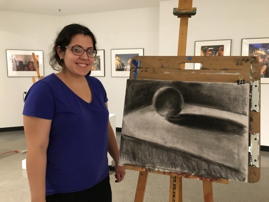
Isaac Akers – Chiaroscuro drawing on toned paper

Domonique Taylor – Chiaroscuro drawing on toned paper

Barbara Winters – Chiaroscuro drawing on toned paper
Thank you to all my amazing students! It has been a joy to have you in class!